Layout
With blueprints you can create highly customized layouts that display the perfect interface for any type of data.
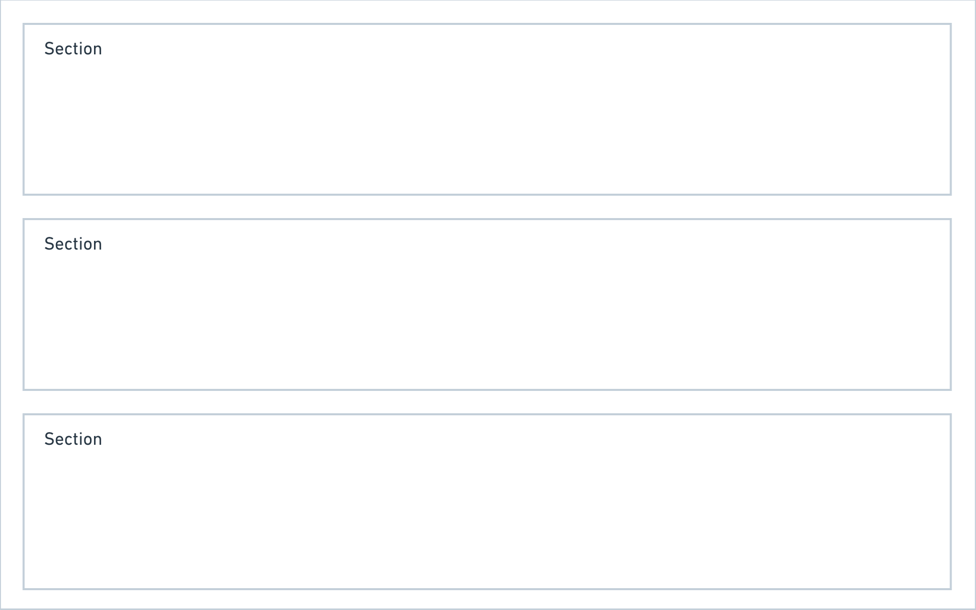
Columns
A blueprint layout is made up of columns, and each column can hold any number of sections. Kirby ships with the following section types:
You can combine those section types in any way you like and also use multiple sections with the same type in a single blueprint layout.
For one page type you might need a list of all subpages, files and a few form elements, whereas for the next page type you just need subpages or a gallery. With sections, all this is possible.
A closer look at pages sections
Show subpages as cards or list, add additional info for each page, control the card design – there are hardly any limits.
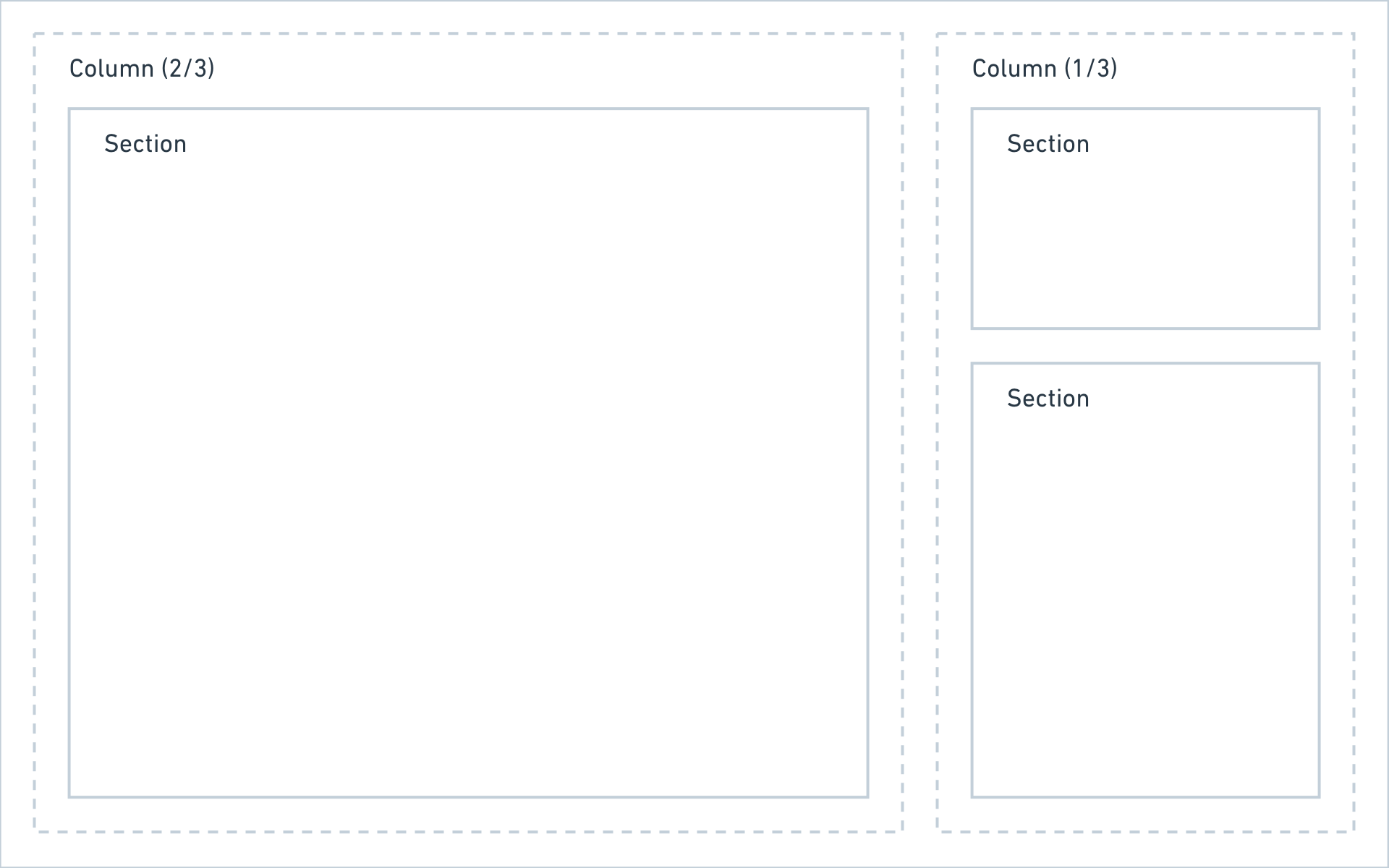
Defining columns
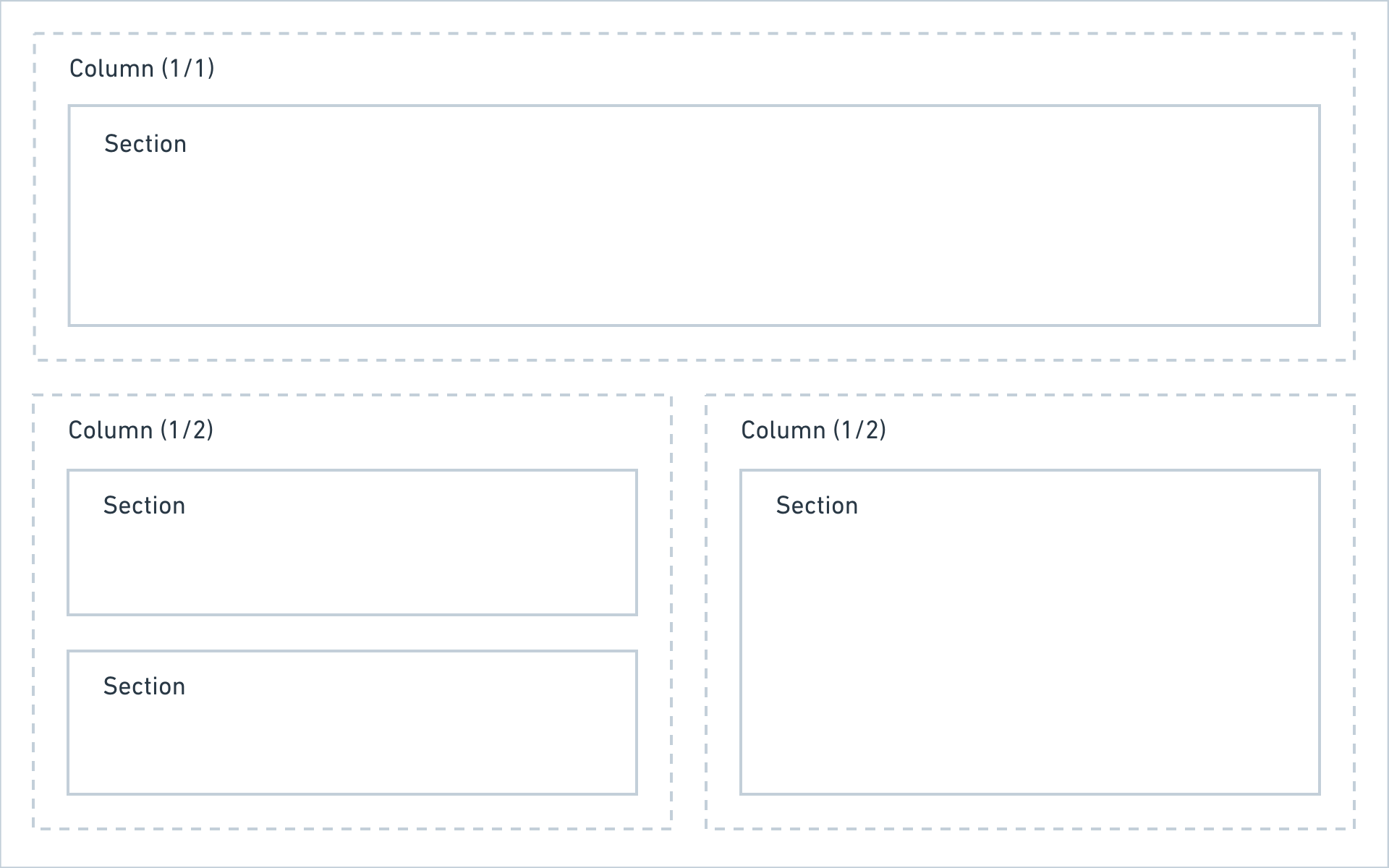
Columns can be defined in two ways:
Named columns
title: My blueprint

columns:
  left:
    width: 2/3
    sections:
      # sections in the left column
  right:
    width: 1/3
    sections:
      # sections in the right column
Unnamed columns
title: My blueprint

columns:
  - width: 2/3
    sections:
      # sections in the left column
  - width: 1/3
    sections:
      # sections in the right column
If you want to extend columns, you have to use named columns.
The following widths are available when defining columns:
1/2, 1/3, 1/4, 2/3, 2/4, 3/4
Sticky columns
You can make an entire column sticky. This can be handy for a setup with a smaller sidebar that should always be available, even when you scroll.
columns:
  - width: 1/3
    sticky: true
    sections:
      # sections in the sticky column
Adding sections
Once you have set up your base column layout, the fun part begins and you can now add some sections.
title: My blueprint
columns:
# main
main:
width: 2/3
sections:
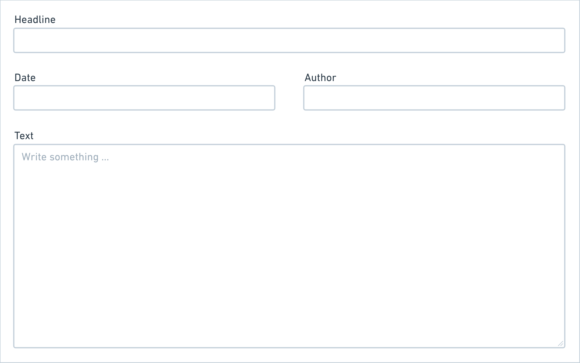
# a simple form
content:
type: fields
fields:
headline:
label: Headline
type: text
text:
label: Text
type: textarea
# sidebar
sidebar:
width: 1/3
sections:
# a list of subpages
pages:
type: pages
label: Subpages
# a list of files
files:
type: files
label: FilesResult
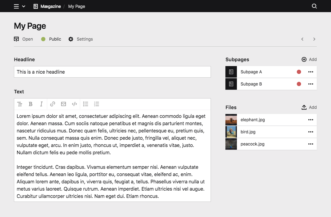
You can probably already see how flexible this is. By slightly changing the columns, we can change the interface drastically.
Sidebar on the left
title: My blueprint

columns:

  # sidebar
  sidebar:
    width: 1/3
    sections:
      # a list of subpages …
      # a list of files …

  # main
  main:
    width: 2/3
    sections:
      # a simple form …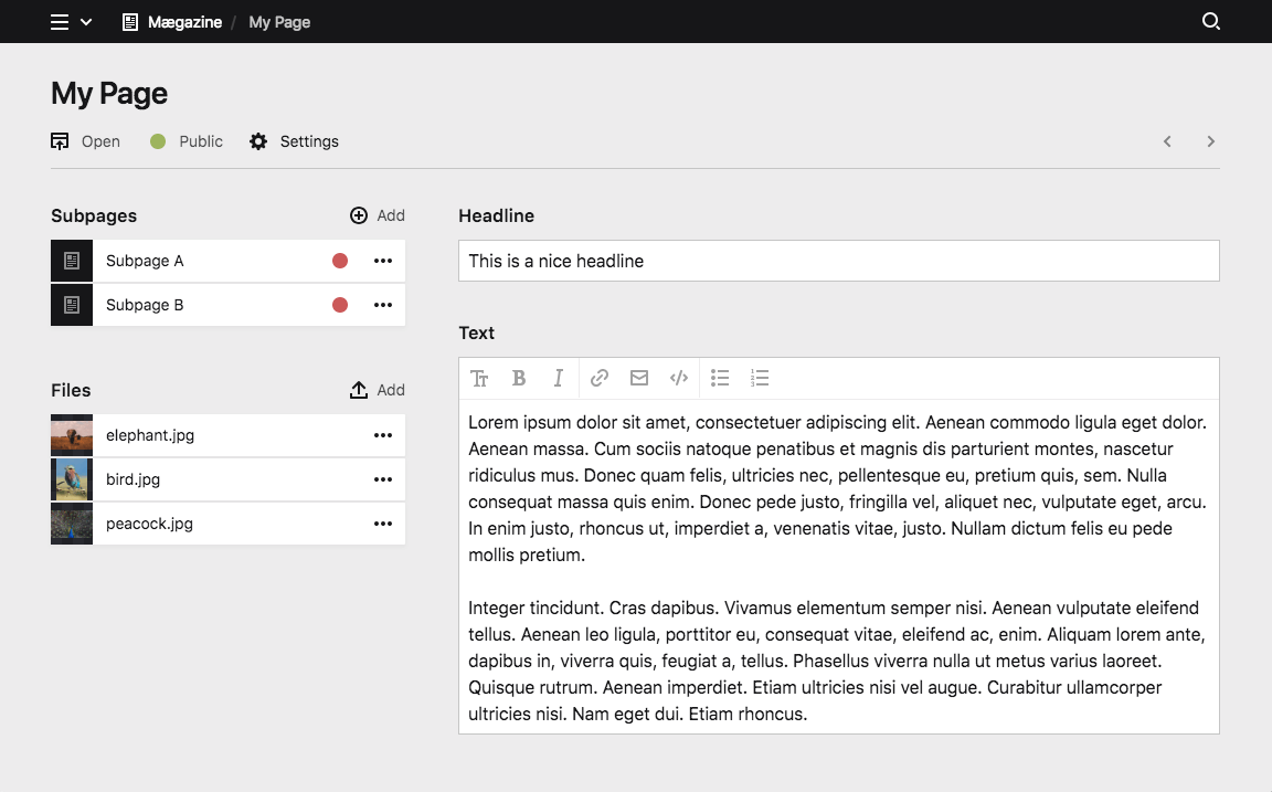
Two Sidebars
title: My blueprint

columns:

  # sidebar left
  sidebar_left:
    width: 1/4
    sections:
      # a list of subpages …

  # main
  main:
    width: 2/4
    sections:
      # a simple form …

  # sidebar right
  sidebar_right:
    width: 1/4
    sections:
      # a list of files …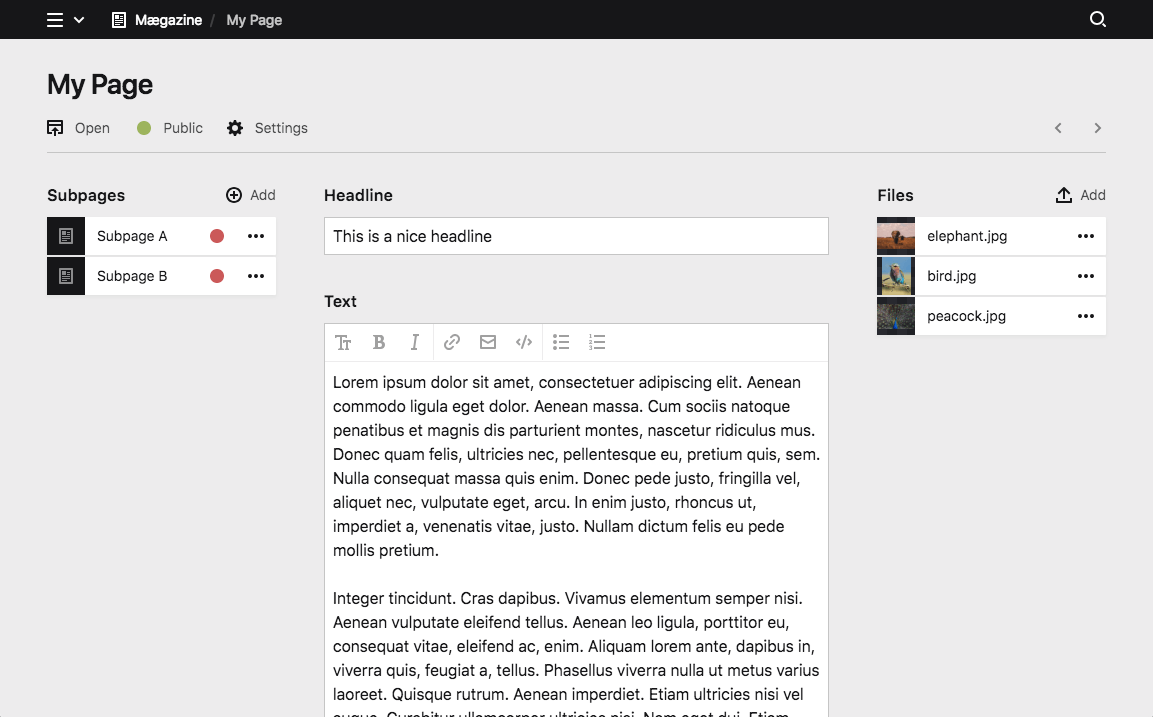
Single-column layouts
If you don't need multiple columns, you can keep your blueprint a lot shorter by using the sections option instead of defining columns. This will automatically create a single-column layout for you, where all sections are listed below each other.
title: My blueprint

sections:
  drafts:
    type: pages
    label: Drafts
    status: draft
  published:
    type: pages
    label: Published pages
    status: listed
Just some fields
Some blueprint types don't even need sections at all and a simple form is enough. In this case you can make your blueprints even shorter and add the fields definition directly without defining sections or columns.
title: My blueprint

fields:
  headline:
    label: Headline
    type: text
  text:
    label: Text
    type: textarea
Adapt all to your needs
Kirby gives you the flexibility to set up the Panel, so that it adapts to the needs of every single page/template. Use the layout possibilities to create the structure that works best for you:
title: My blueprint

columns:
  gallery:
    width: 1/1
    sections:
      gallery:
        type: files
        layout: card
        ...

  review:
    width: 1/2
    sections:
      drafts:
        type: pages
        status: draft
        ...
      review:
        type: pages
        status: unlisted
        ...

  published:
    width: 1/2
    sections:
      published:
        type: pages
        status: listed
        ...
If this isn't yet enough ways and space for you to structure your sections and fields, move on with…
Tabs
When your blueprints get more complex, splitting up your view into multiple tabs helps to keep them organized. Tabs are basically wrappers around regular blueprint layouts. Check out how to create layouts before you get started with tabs.
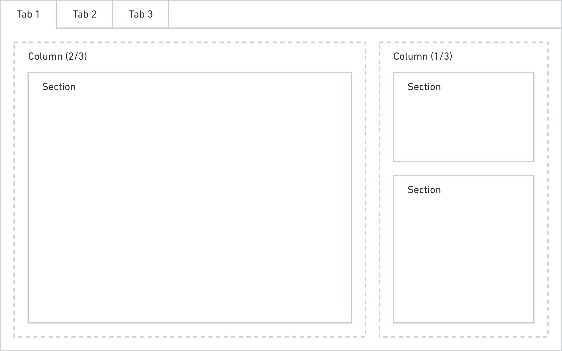
A tab definition has three options:
- label
- columns
- icon
The icon is optional. Please check out the list of available icons. You can also use an emoji by pasting it directly into the blueprint.
title: My blueprint

tabs:
  content:
    label: Content
    icon: text
    columns:
      # layout
  seo:
    label: SEO
    icon: search
    columns:
      # layout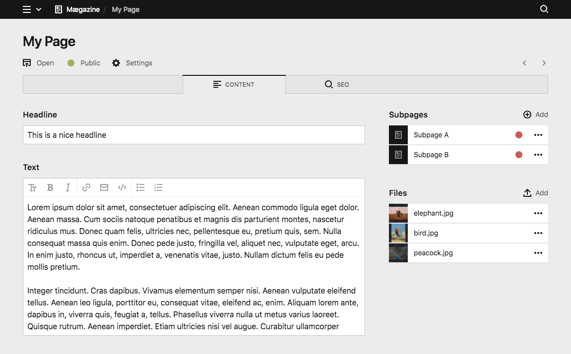
Full example
title: My blueprint

tabs:

  # content tab
  content:
    label: Content
    icon: text
    columns:

      # main
      left:
        width: 2/3
        sections:

          # a simple form
          content:
            type: fields
            fields:
              headline:
                label: Headline
                type: text
              text:
                label: Text
                type: textarea

      # sidebar
      right:
        width: 1/3
        sections:

          # a list of subpages
          pages:
            type: pages
            label: Subpages

          # a list of files
          files:
            type: files
            label: Files

  # seo tab
  seo:
    label: SEO
    icon: search
    fields:
      seoTitle:
        label: SEO Title
        type: text
      seoDescription:
        label: SEO Description
        type: text