Fields section
Define forms for your content
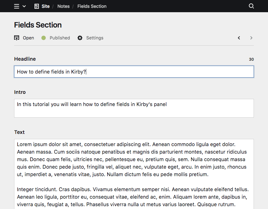
With the fields section you can create flexible forms for your pages. Add all fields in a single fields section or combine multiple sections to achieve more intuitive Panel layouts.

Example
title: Article

sections:
  content:
    type: fields
    fields:
      headline:
        label: Headline
        type: text
      intro:
        label: Intro
        type: textarea
      text:
        label: Text
        type: textarea
Section shortcuts
For simple sections that are only used once per blueprint, you can use shortcuts. In its most basic form, a fields section consists of the section type as name, and a set of fields:
sections:

  fields:
    fields:
      tags: true
      textarea: true
This will add a fields section the given fields.
Keep in mind that the same section name can only be used once per blueprint.
Section properties
The fields section has only one option called fields. The fields option contains a list of field definitions (see example above). Check out the docs for each field type linked below to see what you can do with each field.
Available field types
Multiple fields sections
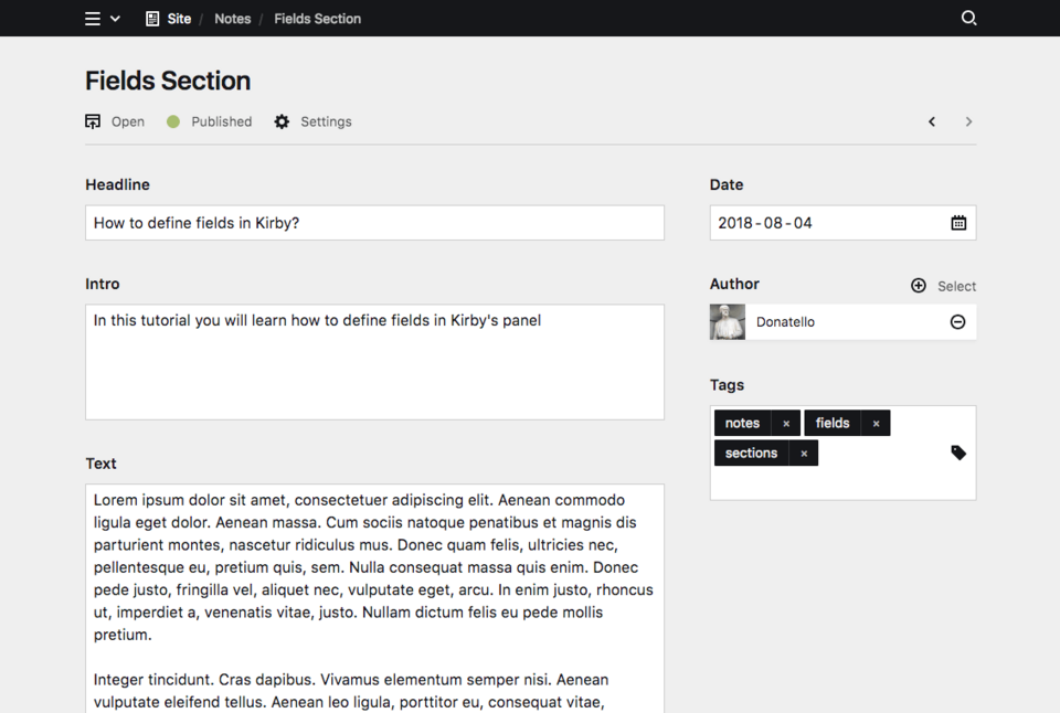
Especially for more complex pages with lots of different field types, it often makes sense to layout fields in multiple columns. That way you can create a main area for the most important content and a sidebar for secondary information for example.

We can use the columns option in our blueprint to create such a layout. The number of columns is up to the actual requirements for your page type. You can get started with two columns and a classic sidebar layout, but of course it can get a lot more sophisticated than that. If you aren't yet familiar with using columns to layout your sections, check out the guide.
title: Article

columns:

  # main content
  main:
    width: 2/3
    sections:
      content:
        type: fields
        fields:
          headline:
            label: Headline
            type: text
          intro:
            label: Intro
            type: textarea
            size: small
          text:
            label: Text
            type: textarea
            size: large

  # meta information
  sidebar:
    width: 1/3
    sections:
      meta:
        type: fields
        fields:
          date:
            label: Date
            type: date
          author:
            label: Author
            type: users
            multiple: false
          tags:
            label: Tags
            type: tags
Tabs
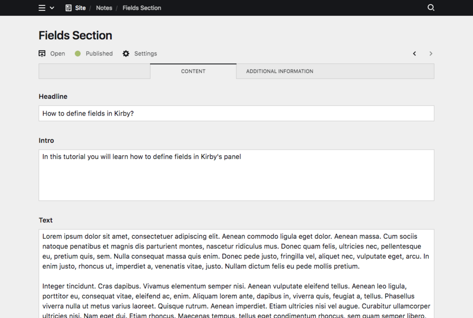
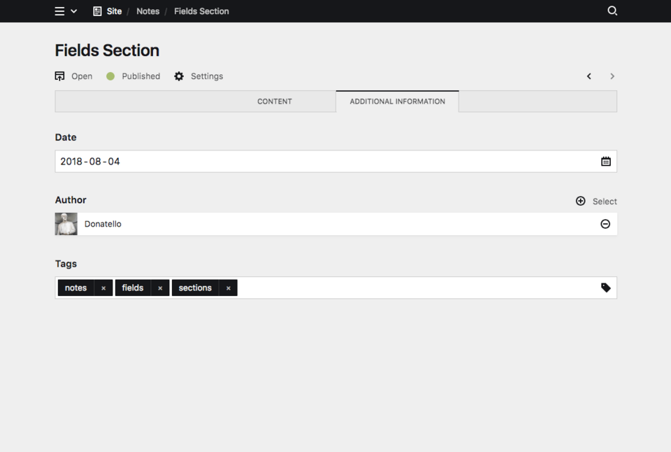
When the field setup gets too complex, you can also spread forms over multiple tabs. This helps to structure your content even further and simplify the editing tasks for your editors. For example SEO information might be stored in an extra tab, because it's not updated very often, once the page is created.
Here's an example how to move the meta information for the article above into another tab.
Content Tab

Info Tab

Blueprint
title: Article

tabs:

  # main content
  content:
    label: Content
    sections:
      content:
        type: fields
        fields:
          headline:
            label: Headline
            type: text
          intro:
            label: Intro
            type: textarea
            size: small
          text:
            label: Text
            type: textarea
            size: large

  # meta information
  meta:
    label: Additional information
    sections:
      meta:
        type: fields
        fields:
          date:
            label: Date
            type: date
          author:
            label: Author
            type: users
            multiple: false
          tags:
            label: Tags
            type: tags
Shortcuts
Fields are such an important feature for pretty much any page type that we've created a number of shortcuts to add fields to blueprints faster.
A page with just fields
If you need nothing more than fields for a page setup, you can use the fields option at the top-level of your YAML file to add all your fields without creating any sections.
title: Article

fields:
  headline:
    label: Headline
    type: text
  intro:
    label: Intro
    type: textarea
    size: small
  text:
    label: Text
    type: textarea
    size: large
Fields in columns
If you want to layout different sections you can still use the fields shortcut in a column to create a fields section in there.
title: Article

columns:

  # main content
  main:
    width: 2/3
    fields:
      headline:
        label: Headline
        type: text
      intro:
        label: Intro
        type: textarea
        size: small
      text:
        label: Text
        type: textarea
        size: large

  # meta information
  sidebar:
    width: 1/3
    fields:
      date:
        label: Date
        type: date
      author:
        label: Author
        type: users
        multiple: false
      tags:
        label: Tags
        type: tags
Fields in tabs
You can also create tabs with just fields and without the need to create any sections.
title: Article

tabs:

  # main content tab
  content:
    label: Content
    fields:
      headline:
        label: Headline
        type: text
      intro:
        label: Intro
        type: textarea
        size: small
      text:
        label: Text
        type: textarea
        size: large

  # meta tab
  meta:
    label: Additional Information
    fields:
      date:
        label: Date
        type: date
      author:
        label: Author
        type: users
        multiple: false
      tags:
        label: Tags
        type: tags
Conditional sections
Like conditional fields, sections can be shown/hidden based on the value of a given field (i.e. if a toggle is checked, a select field is at a certain option, etc.).
The condition for displaying the section is set with the when option. In the when option you define a field name as the key and the required value of that field. In the following example, the each section type is shown based on a different value of the postType field:
sections:
  content:
    type: fields
    fields:
      postType:
        type: select
        options:
          - Gallery
          - Image
          - Text
  gallery:
    type: files
    template: gallery-image
    layout: cards
    size: tiny
    when:
      postType: Gallery
  image:
    type: files
    template: single-image
    max: 1
    layout: cards
    when:
      postType: Image
  text:
    type: fields
    fields:
      text:
        type: textarea
      tags:
        type: tags
    when:
      postType: Text